About the project
Details
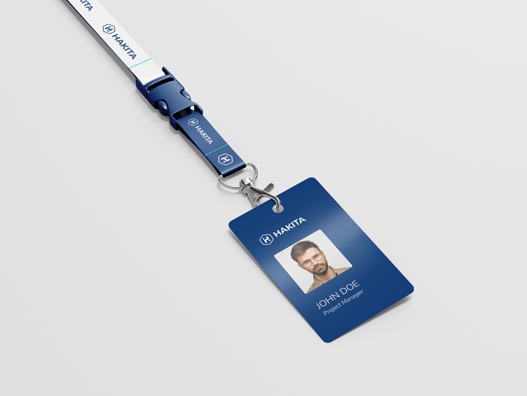
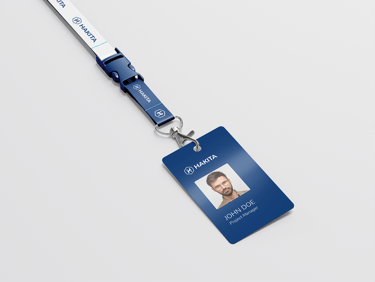
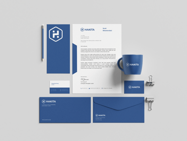
Branding project
Client: Hakita
Year: 2020
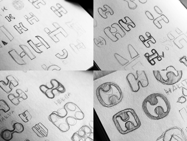
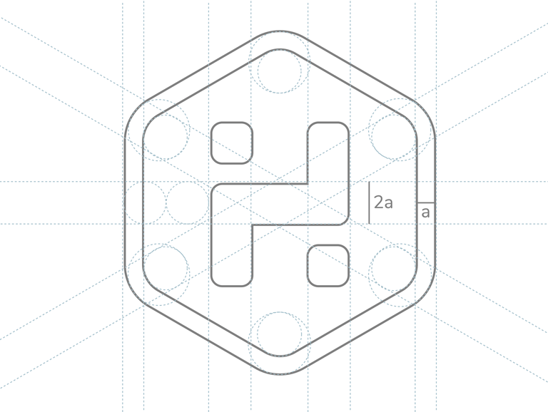
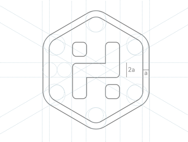
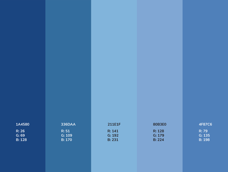
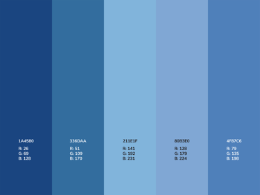
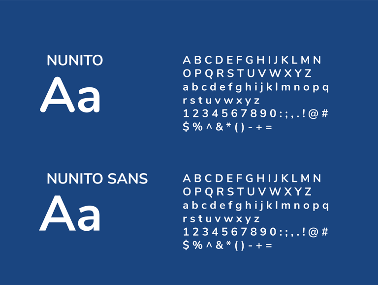
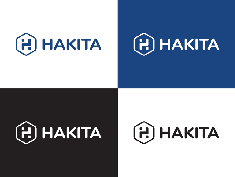
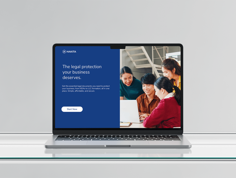
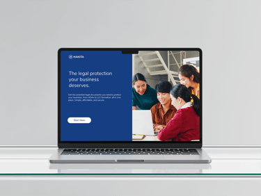
Minimalist Brand Identity Builds Instant Trust (Hakita) Hakita, a new legal service, needed a brand that could make complex law feel simple and trustworthy for a young audience in a crowded market. My strategy was to reject complicated visuals. I designed the logo around the letter 'H' for instant recognition and built the identity on pure simplicity with a single color to feel modern and friendly. This final look gives Hakita a professional yet approachable presence, perfectly matching its mission to simplify legal services through clean, minimal design that immediately earns trust.