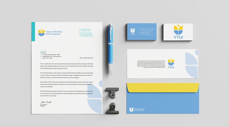
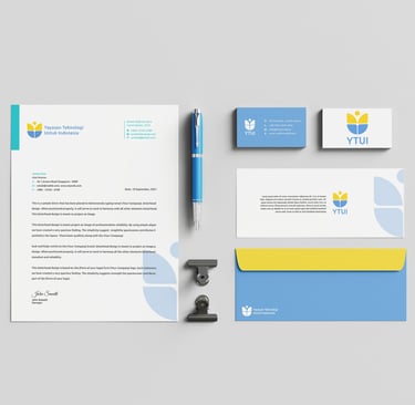
YTUI Brand Identity
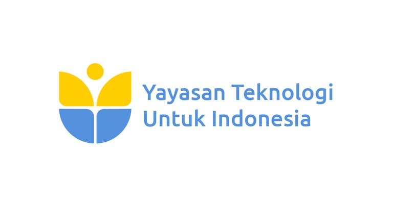
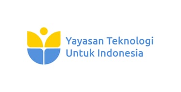
YTUI (Yayasan Teknologi Untuk Indonesia) needed a logo that felt like a handshake: formal, mature, and serious about business. No fluff, no trendy gimmicks.
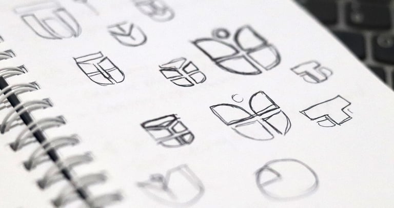
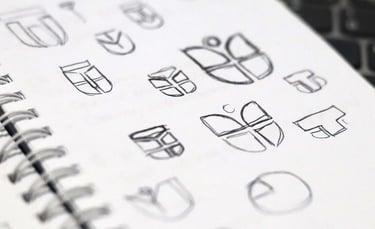
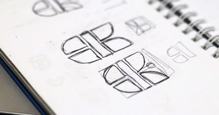
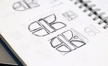
My approach?
Butterfly for evolution. Because tech without change is just a museum piece.
Flower for Bandung. A subtle nod to their hometown, the Flower City, without screaming it.
Negative space magic. Letters Y, T, U, I hidden inside the logo — a quiet flex for those who know how to look.
Result? A mark that’s rooted in identity, built for evolution, and clean enough to stand tall in boardrooms and beyond.